
So far we’ve looked at software tools for handing and analysing data and for writing. Now it’s time to turn to the issue of making figures.
Early in my career, I wish someone had taken me to one side and explained just how important figures are. Too often I see students fretting over the text, reading endless reams of publications out of concern that they haven’t cited enough, or cited the right things. Or fine-tuning their statistical analyses far beyond the point at which it makes any meaningful difference. And yet when it comes to the figures, they slap something together using default formatting, almost as an afterthought.
Having recently written a textbook (shameless plug), it has only brought home to me how crucial figures are to whether your work will get used and cited*. The entry criterion for a study being used in a book isn’t necessarily the quality of science, volume of data or clarity of expression, though I would argue that all of these are high in the best papers. What really sets a paper apart is its figures. Most of us, when we read papers, look at the pictures, and often make a snap judgement based on those. If the figures are no good then the chances of anyone wading through your prose to pick out the gems of insight will be substantially reduced.
Here then is a useful rule of thumb: you should spend at least one working day preparing each figure in a manuscript. That’s after collecting and analysing the data, and after doing a first-pass inspection of the output. A whole day just fine-tuning and making sure that each final figure is carefully and concisely constructed. You might not do it all in one sitting; you may spend 75% of the time trying out multiple formats before settling on the best one. All this is time well spent. And if you’re going to put the time into preparing them then you should look into bespoke software that will improve the eventual output.
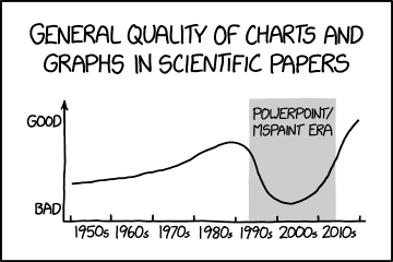
Easy to use does not mean good quality! Comic by XKCD.
Presenting statistical outputs
If you’ve been following this series of posts then it will come as no shock that I don’t recommend any of Microsoft’s products for scientific data presentation. The default options for figures in Excel are designed for business users and are unsuitable for academic publication. Trying to reformat an Excel figure so that it is of the required quality is a long task, and one that has to be repeated from scratch every time**. Then saving it in the right format for most journals (a .tiff or .eps file) is even less straightforward. As an intermediate option, and for those who wish to remain in Excel, Daniel’s XL plugin is a set of tools for analysis and presentation that improve its functionality for scientists.
Needless to say, this is all easier in R with a few commands and, once you’ve figured it out, you can tweak and repeat with minimal effort (the ggplot2 package is especially good). The additional investment in learning R will be rewarded. In fact, I’d go so far as to say that R is worth the effort for preparing figures alone. No commercial product will offer the same versatility and quality.
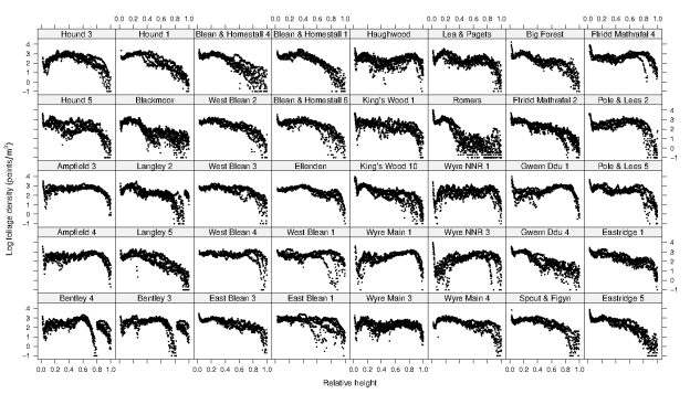
Here’s one I made earlier, showing foliage profiles in 40 woodlands across the UK. Try creating that in Excel.
One of the reasons I recommend ggplot2 is that it is designed to follow the principles of data presentation outlined in Edward Tufte’s seminal book The Visual Display of Quantitative Information. It’s one of those books that people get evangelical about. It will change the way you think about presenting data, and forms the basis for the better scientific graphing tools.

What do you mean you haven’t read it? OK, you don’t have to, but it will convince you that data can be aesthetically pleasing as well as functional.
If you’re not an R user then a good alternative is the trusty gnuplot. Older readers can be forgiven for shedding a nostalgic tear, as this is one of the ancient software tools from the pre-internet age, having been around for about 30 years. It lives on, and has been continually maintained and developed, making it just as useful today as it was then.
A colleague pointed me towards D3.js, which is a JavaScript library that manipulates documents based on data input. I haven’t played with it but it might be an option for those who want to quickly generate standardised and reproducible reports.
Finally, if your main aim is to plot equations, then Octave is a free alternative to the commercial standard MATLAB. Only the most mathematical of biologists will want to use this though.
Diagrams
Some people try to produce diagrams using PowerPoint. No. Don’t do it. They will invariably look rubbish and unprofessional.
For drawing scientific diagrams, the class-leader is the fearsomely expensive Adobe Illustrator. Don’t even consider paying for your own license though because the free Inkscape will do almost everything you’ll ever need, unless you’re a professional graphic designer, in which case someone else is paying. Another free option is sK1 which has even more technical features should you need them. Xara Xtreme may have an awful name but it’s in active development and looks very promising. It’s also worth mentioning LibreOffice Draw, which comes as part of the standard LibreOffice installation.
One interesting tool I’m itching to try is Fiziko, which is a MetaPost script for preparing black-and-white illustrations for textbooks which mimic the appearance of blocky woodcuts or ink drawings. It looks like some effort and experience is required to use it though.
Image editing
The expensive commercial option is Photoshop, which is so ubiquitous that it has even become its own verb. For most users the free GIMP program will do everything they desire. I also sometimes use ImageMagick for image transformation, but mostly the command-line tool sam2p. Metadata attached to image files can be read and edited with ExifTool.
A common task in manuscripts is to create a simplified vector image, perhaps using a photo as a template. You might need to draw a map, show the structure of an organ or demonstrate an animal’s behaviour. For this there are specialist tools like Blender, Cheetah3D for Mac users or Google’s SketchUp, though the latter only offers a limited version for free download. Incidentally, never use a pixel art program (like Photoshop) to trace an image. All you end up with is a simplified pixel image of the original, which looks terrible. Plus you’ve paid for Photoshop.
For the rather specialised task of cropping and assembling documents from pdf files, briss might be an ancient piece of software but it’s still the go-to application.
Preparing outline maps (e.g. of study sites) is a common task and an expensive platform like ArcGIS is unnecessary. Luckily the free qGIS is almost as good and improving rapidly. There’s a guide to preparing maps here.

A map showing the study site in a forthcoming paper (Hooper & Eichhorn 2016) and prepared by Jon Moore in qGIS.
There are countless programs out there for sorting, handling and viewing photographs (e.g. digiKam, Shotwell). Not being much of a photographer I’m not a connoisseur.
Flowcharts
Flowcharts, organisational diagrams and other images with connected elements can be created in LibreOffice Draw. I’ve not used it for this though, and therefore can’t compare it effectively to commercial options like OmniGraffle, which is good but expensive for something you might not be doing regularly. A LaTeX-based option such as TikZ is my usual choice, and infinitely better than spending ages trying to get boxes to snap to a grid in Powerpoint. If you’re not planning to put the time into learning LaTeX then this is no help, but add it to the reasons why you might. If anyone knows of a particularly good FOSS solution to this issue then please add in the comments and I will update.

I made this in TikZ to illustrate the publication process for my MSci class in research skills. I won’t lie, it took a long time (even as a LaTeX obsessive), and I’d like to find a more efficient means of creating these figures.
Animations
This is one task that R makes very easy. Take the output of a script that creates multiple PNG files from a loop and bundle them into an animation using QuickTime or the very straightforward FFmpeg. For something that looks so impressive, especially in a presentation, it’s surprisingly easy to do.
Collecting data
To collect data from images ImageJ is by far the best program, largely due to the immense number of specialist plug-ins. Some of these have been collected into a spin-off called Fiji, which provides a great set of tools for biologists. Whatever you need to do, someone has almost certainly written a plug-in for it. Note that R can also collect data from images and even interfaces with ImageMagick via the EBimage package. Load JPEGs with the ReadImage package and TIFF files with rtiff.
A common task if you’re redrawing figures, or preparing a meta-analysis, is to extract data from figures. This is especially common when trying to obtain data from papers published before the digital age, or when the authors haven’t put their original data online. For this, Engauge will serve your needs.
Next time: how to prepare presentations!
* At some point in the pre-digital age, maybe in the 90s, I recall an opinion piece by one textbook author making exactly this point. Was it Lawton, Krebs, Southwood… I really can’t remember. If anyone can point me in the right direction then I’d be grateful because I can’t track it down.
** I did overhear one very prominent ecologist declare only half-jokingly that they stopped listening to talks if they saw someone present an Excel figure because it indicated that the speaker didn’t know what they were doing. Obviously I wouldn’t advocate such an extreme position, but using Excel does send a signal, and it’s not a good one.

I have been using Paint.NET http://www.getpaint.net/index.html as an alternative to Photoshop. It is also open source, free, and many plug-ins have been created by other users. The only thing which always annoyed me was adding text, because you cannot easily change it later. After I read your post I just had a quick look at Inkscape and it seems to have all the text-related functionality I always missed in Paint.NET! So thanks a lot for your post, this really made my day!
LikeLiked by 1 person
Great, really glad I could help! I’ve not heard of Paint.NET before, so I’ll give it a spin.
LikeLike
I need to try some of these out, am still wedded to Excel I’m afraid (though FYI I could easily make that in Excel!) Great shout out for Tufte, I have a few of his books and the guy really made me think about effective data presentation.
LikeLike
Fair enough. But I bet I’d win in a race :o)
LikeLiked by 1 person
No doubt you are right!
LikeLike
Just revisiting this post for ideas on how to produce good flow charts. In addition to the ones you point out, I have found a few good free options via this reddit thread https://www.reddit.com/r/learnprogramming/comments/1y0a1u/is_there_good_free_flowchart_software_out_there/.
So far, I think I like Google Drawing the most, it is simple and very user-friendly. See tips on how to use it here https://support.google.com/docs/answer/179740?hl=en
I have found others such as dia (http://dia-installer.de/), draw.io (https://www.draw.io/), and pencil (http://pencil.evolus.vn/) a bit clunky so far.
Also, you might be interested in TikzEdt (http://www.tikzedt.org/) which provides a WYSIWYG interface for Tikz code.
And thanks for the post, always useful to be able to come back when I need to find a new bit of software.
LikeLiked by 1 person
Thanks Phil! I’ll give these a try. If only TikzEdt was available on platforms other than Windows…
LikeLike
There is a ‘preliminary version’ of TikzEdt available for linux here: https://code.google.com/archive/p/tikzedt/downloads.
Also found this list which might be useful to find other options http://www.texample.net/tikz/resources/
LikeLike
Cool, thanks!
LikeLike
Pingback: Free software for biologists pt. 5 –operating systems | Trees In Space
Pingback: Free software for biologists pt. 4 – presentations | Trees In Space